
Mobile SEO: How to Optimise Your Website for Mobile Search
Mobile SEO is the process of improving a website so that it works well for people using smartphones and other mobile devices, while also making it easier for search engines to understand and rank its pages. It brings together technical SEO, useful content and a smooth mobile experience.
With many people searching, browsing and shopping on their phones, a mobile-friendly website is essential. A page that is difficult to read, slow to load or awkward to use can drive visitors away. By contrast, a well-optimised mobile site can help users find information quickly and support your wider search performance.
What is mobile-first indexing?
Google primarily uses the mobile version of a website’s content for indexing and ranking. This is known as mobile-first indexing. It does not mean that a site must have a separate mobile domain, or that desktop results no longer matter. It does mean that the mobile version should contain the important content and metadata you want search engines to find.
If your mobile site hides useful text, removes links or offers less structured data than the desktop version, search engines may have less information to work with. Aim to provide a consistent experience and broadly equivalent content across devices.
Why mobile SEO matters
- It meets user expectations: Visitors expect pages to load quickly and be easy to navigate on a small screen.
- It supports search visibility: A usable mobile experience helps search engines access and understand your pages.
- It can improve engagement: Clear layouts and helpful content make it easier for visitors to take the next step.
- It matters for local searches: People often use phones to find nearby services, opening hours, directions and contact details.
Key mobile SEO best practices
Use a responsive design
A responsive website adjusts its layout to suit different screen sizes. This is usually easier to maintain than separate desktop and mobile sites, as the same URL and content can serve all users.
Check that layouts adapt naturally rather than simply shrinking. Text should remain readable, images should fit the screen, and users should not need to scroll horizontally to view essential content.
Make pages fast and stable
Mobile visitors may be using slower connections or less powerful devices, so performance matters. Large images, unnecessary scripts and excessive third-party tools can make pages slow or unstable.
To improve performance:
- Compress images and use appropriately sized files.
- Use modern image formats where they are supported.
- Remove scripts, plug-ins and features that are not needed.
- Load below-the-fold images only when they are needed.
- Use browser caching and a content delivery network where appropriate.
- Reduce layout shifts by reserving space for images, adverts and embedded content.
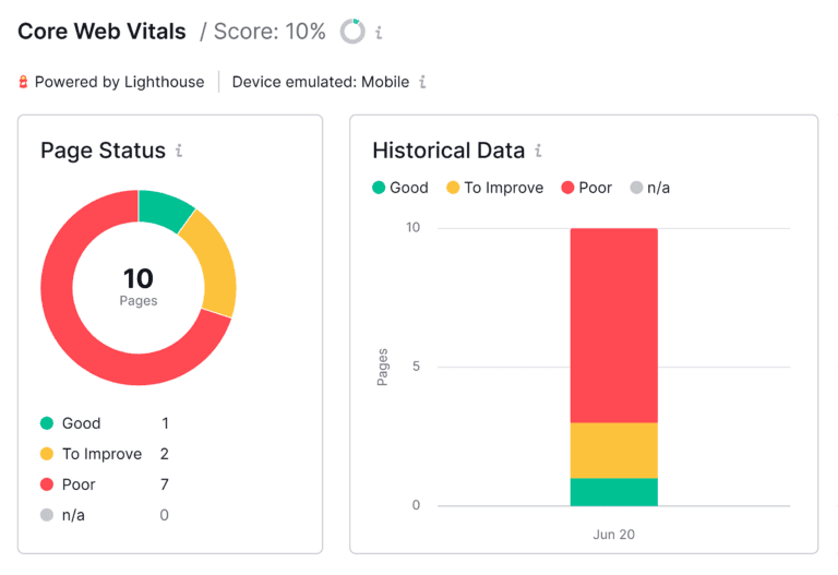
Google’s Core Web Vitals measure aspects of loading performance, interactivity and visual stability. They are useful diagnostic signals, but they should be considered alongside content quality, accessibility and the overall experience rather than treated as a substitute for them.
Make navigation easy to use
On a small screen, complicated menus can quickly become frustrating. Keep navigation concise, make key pages easy to reach and ensure buttons and links have enough space to tap comfortably.
Important actions—such as calling a business, making a booking or completing a purchase—should be easy to find. Avoid intrusive pop-ups that cover the main content, especially when visitors first arrive on a page.
Keep content clear and useful
Mobile users often want answers quickly. Use descriptive headings, short paragraphs and lists where they make information easier to scan. Put the most useful information near the top, but do not remove detail that readers need.
Do not create a thin or incomplete mobile version simply to make pages shorter. Search engines need access to the main content, and visitors should be able to find the same essential information whether they use a phone or a computer.
Optimise images and media
Images can enrich a page, but oversized files can slow it down. Resize images to suit their display dimensions, compress them and write helpful alternative text when an image conveys information. Decorative images can generally use empty alternative text so they are not unnecessarily announced by screen readers.
Make sure videos and other embedded content fit smaller screens. Provide captions for video where possible and avoid media that starts playing unexpectedly or consumes large amounts of data.
Use mobile-friendly forms
Long forms can be difficult to complete on a phone. Ask only for information you genuinely need, use appropriate input types and provide clear labels and error messages. For example, a correctly configured telephone field can make entering a number easier on a mobile keyboard.
Support local search
If your business serves a particular area, make essential local information easy to find. Keep your business name, address, telephone number and opening hours accurate and consistent. A well-maintained business profile on relevant search platforms can also help people discover and contact you.
Local pages should offer genuine value. Avoid creating large numbers of near-identical pages that differ only by place name; instead, provide useful, accurate information for each area you serve.
Check structured data and metadata
Make sure page titles, meta descriptions and structured data are available to search engines on the mobile version of your site. Structured data should accurately describe the visible content and follow the relevant guidelines. It can help search engines interpret a page, although it does not guarantee enhanced search results.
How to test your mobile SEO
Review your site on several real devices and screen sizes, not just in a desktop browser preview. Look for text that is too small, buttons that are hard to tap, content that overflows the screen and pages that take too long to load.
You can also use tools such as Google Search Console, PageSpeed Insights and browser developer tools to identify crawling, performance and usability issues. Check a range of important templates—such as product pages, service pages, articles and contact forms—rather than testing only the homepage.
Common mobile SEO mistakes
- Hiding important content or links on mobile devices.
- Using a layout that forces visitors to zoom or scroll sideways.
- Serving large, uncompressed images.
- Using pop-ups that obstruct the page or are difficult to close.
- Making buttons and links too small or too close together.
- Maintaining inconsistent content or metadata between mobile and desktop versions.
- Focusing only on technical scores while overlooking the needs of real visitors.
Mobile SEO checklist
- The website adapts to different screen sizes.
- Key content and links are available on mobile.
- Pages load promptly and remain visually stable.
- Text is readable without zooming.
- Navigation, buttons and forms are easy to use.
- Images and videos are optimised for mobile connections.
- Contact and local business details are accurate.
- Important pages have been checked in Search Console and performance tools.
Conclusion
Effective mobile SEO is about more than fitting a website onto a smaller screen. It means making pages fast, accessible and straightforward to use, while ensuring search engines can find the same important content as visitors can. Regular testing and improvements can help create a better experience for mobile users and support your website’s performance in search.
7 Essential Tips for Optimising Mobile SEO
- Use responsive design that works on every screen size.
- Make pages load quickly on mobile networks.
- Keep text readable without zooming.
- Use buttons and links that are easy to tap.
- Ensure mobile pages include the same key content as desktop pages.
- Optimise images to reduce loading times.
- Test pages with Google’s mobile-friendly tools.
Use responsive design that works on every screen size.
Use responsive design to ensure your website adapts smoothly to every screen size, from smartphones and tablets to desktop computers. Text should remain easy to read, images should fit the screen, and menus and buttons should be simple to use without zooming or horizontal scrolling. A consistent experience across devices helps visitors find what they need and makes it easier for search engines to crawl and understand your content.
Make pages load quickly on mobile networks.
Make pages load quickly on mobile networks by keeping files lightweight and removing anything that slows the experience. Compress images, use modern image formats, limit unnecessary scripts and plugins, and load below-the-fold content only when needed. Test your pages on different devices and connection speeds, as a fast, responsive site helps visitors find what they need without waiting.
Keep text readable without zooming.
Keep text readable without zooming so mobile visitors can understand your content comfortably on a small screen. Choose a clear font, use a suitable text size and provide enough spacing between lines and paragraphs. Check your pages on different devices, as text that looks fine on a desktop may be too small on a phone. Readable text makes your site easier to use and helps visitors find the information they need.
Use buttons and links that are easy to tap.
Make buttons and links easy to tap on a mobile screen by giving them enough size and space, so users can select the right option without zooming or accidentally tapping something else. Use clear labels, place important actions where they are easy to find, and check that links remain comfortable to use on different screen sizes. This small improvement can make your site more accessible and enjoyable to use, helping visitors move around and complete tasks with less frustration.
Ensure mobile pages include the same key content as desktop pages.
Ensure your mobile pages include the same key content as your desktop pages. Search engines primarily use the mobile version of a site for indexing, so hiding important text, links, images or structured data on mobile can make it harder for them to understand your pages. Keep essential information available across devices, while adapting the layout to make it easy to read and use on a smaller screen.
Optimise images to reduce loading times.
Optimise images to help your mobile pages load faster. Large image files can slow a site down, particularly for visitors using mobile data, so resize images to the dimensions they will appear at and compress them to reduce file size without noticeably affecting quality. Use modern formats such as WebP where suitable, and consider lazy-loading images that sit below the first screen. Faster-loading pages are easier to use and can support a better overall mobile experience.
Test pages with Google’s mobile-friendly tools.
Test your pages with Google’s mobile-friendly tools to spot issues that could make your site difficult to use on a phone. Google Search Console and PageSpeed Insights can help you check mobile usability, loading performance and common technical problems. Review key page types regularly, then fix issues such as text that is hard to read, content that extends beyond the screen or interactive elements that are difficult to tap.
Leave a Reply